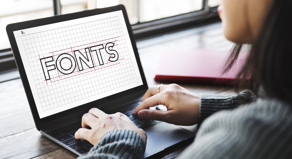
First impressions are everything. In an age where we browse through a myriad of data on the internet each day, our brains cope by learning how to filter out messages that don’t appeal to us within the first few seconds of contact. In business, your logo and your visual tools need to communicate the brand personality, professionalism, and reliability. Every brand has a message for its consumers. Just as color can influence a person’s emotional response subconsciously, font choice can help to underscore or undermine your brand’s message.
A study by Kevin Larson of Microsoft and Rosalind Picard of MIT shows that respondents who were given copies with better typography gave better performances with cognitive tasks because good typography incites a better mood among readers. Fonts and typefaces carry your brand’s message to consumers, so as a rule, they should also be easy to read.
It’s important to note that you don’t need to be an expert on every facet of design and marketing when running a business. That’s too much to ask of someone who’s already busy with the management side of things. When in doubt about your brand’s visual materials, you can always seek help from a graphic designer. They are trained to create visual materials that can successfully communicate your brand’s personality while making it eye-catching and appealing to consumers. No amount of exposure through Facebook ads and email marketing will do well for your brand if your logo and visual tools are subpar.
Personality
How do you determine what font is best for your brand? Take a look at your brand’s personality and find something that reflects that. If the services that your brand offers are conventional and formal, you might want to go for something classic serif or sans serif font. This is fine, but remember that the font should also help you to stand out. Instead of going for the overused Helvetica or Times New Roman, try Bebas Neue or Libre Baskerville for a similar spirit in a fresher body.
But if your brand is more niche, you can afford to be more creative and look into more unusual font choices. In such cases, you’ll want to opt for a font combination that will also appeal to your specific target market. Benefit Cosmetics is a good example of a brand that isn’t afraid to play with font combinations in its marketing and packaging. The beauty brand is known for its uber playful and feminine visuals inspired by vintage pin-up images. The fonts they use in their packaging can vary depending on the product’s individual personality.
Their Sugarlicious beauty kit, for example, uses the sans serif font Marlowe and script font Luxus Brut. The two complement each other well. Marlowe is a vintage-inspired serif font, and Luxus Brut is an elegant cursive font that contrasts against Marlowe’s wide-set figure and exhibits the sweetness that’s associated with both sugar and femininity – key aspects of the brand and product’s personality.
If your brand is all about playfulness and creativity, avoid using fonts such as Times New Roman and Arial, which many deem dull and unimaginative. Using such fonts for body text when your company logo boasts a creative font might generate dissonance in your consumers. Be consistent.

The digital context
The rules of choosing fonts vary depending on how you will use them and in what context. For instance, serif fonts are popular choices for print media because of their polished and professional personality. But sans serif fonts are the best for presentations because they’re easier to read even from afar. So you might want to stick with a sans serif typeface like Helvetica when you’re making a presentation for a pitch.
Licenses
Once you’re decided on what fonts you’ll use for your logo and visual materials, you’ll need to acquire licenses to use them commercially. When you download a font, it comes with a document detailing the scope you are allowed (and not allowed) to use the font. This agreement is called an End User License Agreement (EULA).
Fonts have different licenses for different uses. For example, a desktop license is a basic license that applies to most of the default fonts on your computer or device. A desktop license authorizes you to use the font for a range of different uses on your computer. This includes using it for logos, graphics, and anything you can create on your computer. The license that you’ll need for your brand is a commercial license. This is so that you and whoever will be designing your logo and other marketing materials will be allowed to use the font for those purposes.
If you’ve ever felt like you’ve taken up too much time deciding what font to use, remember that your concern is justified. Fonts need to be chosen carefully because they can help underscore or undermine the text’s message that they’re carrying. For your brand, you also need to consider whether these fonts are representative of your company’s products, services, and personality. Lastly, make sure that you’ve acquired the necessary licenses for the things you will be using these fonts.